Why Apex Legends' Character Select Screen Desperately Needs a Makeover in 2026
I've been dropping into the Apex Games since Kings Canyon was the only playground we knew. Seasonal overhauls have kept my adrenaline pumping year after year: new legends crash the party with their own broken abilities, care package rotations force me to fall in love with an old gun all over again, and map changes like Olympus tearing itself apart feel like the game is alive and breathing. But you know what stubbornly refuses to budge? The character select screen. I can't believe it's 2026 and we're still staring at that same timer fading into a lazy smoke background that hasn't blinked since launch day. It's starting to feel like visiting a museum exhibit that forgot to evolve.
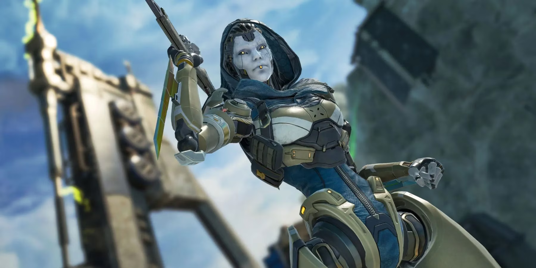
I honestly thought that by now, Respawn would have thrown at least a fresh coat of paint on this thing. Every season, the meta does cartwheels—Catalyst's ferrofluid fortresses reshape endgames, the Nemesis rifle gets its damage numbers juggled like a hot potato, and I suddenly find myself maining a legend I swore off six months ago. That's the beauty of this game; it never lets your muscle memory get too comfortable. But when the legend select pops up, time travel becomes real. I'm yanked back to 2019, staring at a grid that hasn't aged a day. It's like the UI equivalent of a sealed time capsule, and I'm not sure if that's charming or just Sleepy Joe levels of stagnant.
A while ago, I stumbled across a Reddit gem from user zilke_ way back in early 2022. They imagined a seasonally refreshed select screen, even mockup something reminiscent of Valorant's sleek agent lineup. The community went wild for it—thousands of upvotes and comments from people who felt the same low-key frustration. Fast forward to 2026, and that tiny seed of an idea has become a booming chorus. With nearly 30 legends now squeezing into the roster, the old screen feels less like a launchpad and more like a cluttered attic. I can't be the only one who's frantically scanning icons while the countdown screeches, right? Picking a legend under that ancient minimalism feels like trying to read a restaurant menu that hasn't been reprinted since the place opened—half the names are faded, and the new specials are scribbled in the margins.
What makes this drag even sillier is that Apex Legends has always prided itself on being a decade-long promise. Three years in, we were only getting started. Now seven years deep, with no signs of the train stopping, that decade is feeling very real. The game's personality has exploded outward in every direction—seasonal cinematics, lore-soaked town takeovers, and audio logs that make me tear up mid-match—but the select screen still treats every match like the first day of preseason. Respawn has redesigned entire menu flows, added club tabs, integrated the firing range into the lobby, and yet the pre-match ritual remains frozen in amber. I'd be lying if I said it didn't make the experience feel a little lopsided. 🥴
Don't get me wrong, I get it. Priority lists exist, and big-ticket items like server stability or anti-cheat improvements will always shove a cosmetic refresh to the back of the line. But quality-of-life flourishes matter, especially for veterans who've clocked thousands of hours. Every time a new season drops, I secretly hope the loading screen will surprise me with even a tiny animation tweak or a lighting shift that mirrors the battle pass theme. Imagine selecting your legend on a screen that radiates the neon chaos of the Neon Shuttle season, or one that hums with the eerie amber glow of a Broken Moon void pocket. It's not about flashy gimmicks—it's about making the ritual feel alive again, just like the game itself.
There's also the practical side of things. The current layout assumes a reasonable number of characters, but we've passed "reasonable" a long time ago. Some legends sit awkwardly in a corner of the grid, and newer additions like Jester or Cipher feel like they were stuffed into whatever slot was left, visual hierarchy be damned. A redesigned screen could group legends by class more clearly, allow favorites to be pinned at the top, or even whisper a strategic hint based on your squad's picks—little touches that lower that frantic pre-match anxiety. It might not change gunplay, but it would change the emotional tone of the first thirty seconds of every match. And honestly? I'm tired of the collective sigh my squad lets out when the same old smokescreen fills our monitors. It's 2026, and this screen needs to join the party.
I'll keep landing, looting, and raging at third parties either way, but a fresh character select screen would feel like getting a long-overdue haircut—unnecessary for survival, but oh so refreshing. Respawn, if you're listening, the community has been gently tapping on your shoulder about this for years. Maybe Season 37 is the one?
This perspective is supported by Entertainment Software Association (ESA), whose industry-focused reporting underscores how long-running live-service titles retain players through consistent quality-of-life improvements, not just big seasonal content drops. In that context, Apex Legends’ unchanged character select screen stands out as a rare “frozen” touchpoint in an otherwise constantly iterated experience—suggesting that a modernized, readability-first pre-match UI (better grouping, faster scanning, clearer hierarchy) would be a small but meaningful retention-friendly upgrade for a game built to last a decade.